BRITISH fashion brand Burberry has decided to make a change to its logo in a bid to modernise the brand.
Not since 2018 has the fashion house opted for such a ground-breaking change to their approach.
Why is Burberry changing its logo?
Under new chief creative officer Daniel Lee, the fashion house is re-launching itself in a bid to modernise the brand.
Lee was appointed to his position in December 2022, after bringing luxury brand Bottega Veneta to new audiences.
The move involves bringing back a motif entitled "Equestrian Knight Design", something previous creative director Riccardo Tisci opted to remove in 2018.
Burberry has always been associated with "Britishness" and has opted to revamp its image as part of the change.
READ MORE ON BURBERRY
Kate wows in Burberry dress & waves to cheering crowds on US tour with Wills
Hamilton aims to inspire others with daring Burberry kilt ahead of Turkish GP
When did Burberry change their logo?
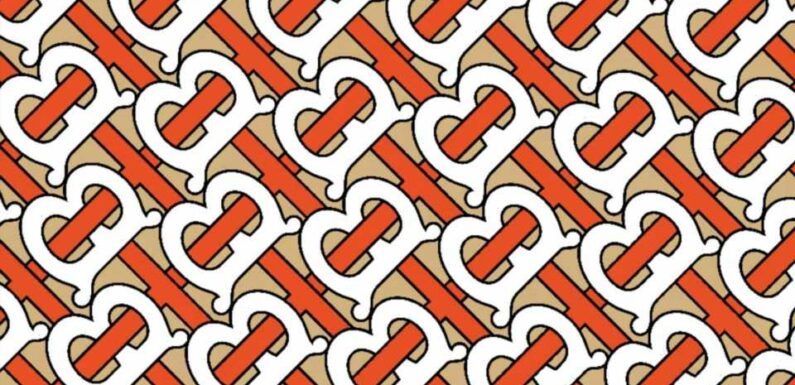
Back in 2018, Riccardo Tisci launched a monogram collection incorporating the letters TB as part of a stylistic change to their approach.
In such a competitive industry, fashion houses need to stay relevant and current to ensure that their appeal to new generations of consumers is far-reaching.
The new logo was designed by Peter Saville and at the time was perceived as a new dawn for the British brand.
It was a radical change of direction which involved getting rid of the classic "Equestrian Knight" following a more simplistic design employed by competitors such as Chanel, Tom Ford, Fendi, Céline, and Louis Vuitton.
Most read in Fabulous
I wear crop tops & mini skirts at work – It's okay because I'm the boss
I’m trolled for my big boobs – women tell me to ‘put a jacket on’ & ‘cover up’
I know exactly why everyone is having sex with multiple lovers in 2023
Mom leaves people horrified by giving twin girls ‘literally the same name’
Why is Burberry undergoing a rebrand?
Burberry has always been linked to luxury and its "Britishness", two things they were always keen to underpin.
Having established the fashion house in 1856, the journey for the fashion house has created an image that is known worldwide.
In modern society, fashion is constantly evolving and no brand can afford to be left in the past.
Competitors have done the same over recent years, looking to improve its appeal to younger generations and Burberry is no different.
What was Burberry's previous Logo?
Originally, the brand had a red logo of the equestrian knight on horseback being the prominent part of its image with the name featuring underneath in smaller font.
In 1968, this became a much smaller focus with "Burberrys" enlarging and become the prime focus while promoting its London roots in the logo.
It was not until 2018 where the original image of the knight was removed with the brand trying to focus just on its name.
However, its new chief creative officer has realised the importance of the motif and how it evokes links to their brand and is something the fashion house needs to be proud of and promote within its new design.
Source: Read Full Article


