Save articles for later
Add articles to your saved list and come back to them any time.
With Apple tipped to hold its annual iPhone and Watch reveal presentation in mid-September, we may be only weeks away from one of the most eventful launch the company has had in years.
From the long-resented Lightning port being put out to pasture to the promise of new software features for all Apple phone and watch users, analysts and leakers have been busy with their predictions on what Apple has in store.
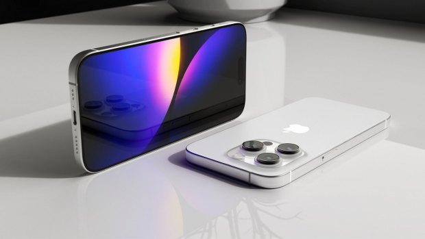
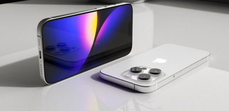
A render of the iPhone 15 Pro by Hans Choi, showing the rumoured USB-C port.Credit: twitter.com/Hanstsaiz
The need for (charging) speed
Apple is once again expected to unveil four different phones, at the same pair of sizes used for the iPhone 14 (that’s 6.1-inch and 6.7-inch). And while we’re not expecting many obvious physical changes, it’s almost certain that we’ll see the new phones equipped with USB-C ports instead of Lightning, to comply with European law.
This will be a welcome change for anyone who wants to charge all their devices with the one cable and adaptor, but it also throws up a host of questions that haven’t yet been answered, and could end up just as annoying as ever.
Early rumours indicated Apple would use special chips to dictate which devices could work over USB-C, as a way to extend its current “Made for iPhone” licensing program. It was also speculated that the company could make sure you only got full charging speeds from official cables.
USB-C means the potential for Thunderbolt 4, and along with it much faster charging speeds and data transfer than we’ve seen on iPhone to date. But would Apple reserve that capability for its more expensive Pro devices?
Since then, leaker Kosutami has shared images of a new colour-matched braided cable that will supposedly come with the iPhone 15, similar to those used for MacBooks and HomePods. But a technical analysis on the cables had good news and bad news; it contained no special chip, but was limited to antiquated USB 2.0 speeds. If accurate, this would mean Apple is either sticking with slower ports, or that it will produce multiple cables with different capabilities.
The approach to Pro
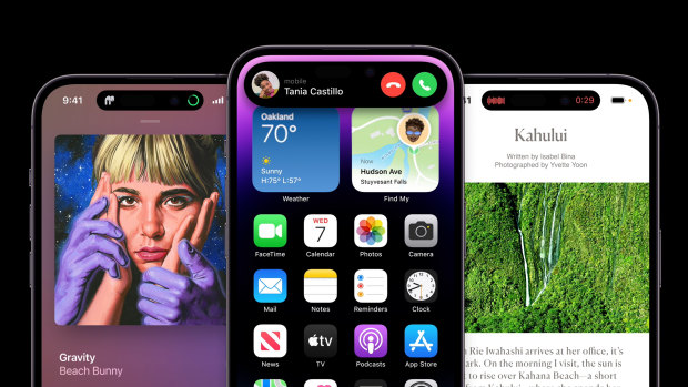
It’s always interesting to see the split of features between the more mainstream iPhone and its power-user Pro counterpart, and this year won’t be any different. The iPhone 15 and iPhone 15 Max are expected to inherit some technology from last year’s Pro, including the Dynamic Island — a split notch at the top of the display used for notifications, media playback, call controls and more — and the A16 chip.
As for the iPhone 15 Pro and Pro Max, analysts are expecting a move to a titanium frame, a new A17 chip and a number of minor design updates. These include thinner bezels (the black borders around the screen), support for Wi-Fi 6E with compatible routers and — for the larger Pro Max only — a periscope camera lens for 5x or 6x zoom.
Last year’s iPhone 14 Pro introduced the dynamic island.
Though the inclusion of the Dynamic Island on the standard phone has been suggested in multiple leaks and reports, it appears that an always-on display and 120Hz refresh may remain exclusive to the Pro phones. And in a strange turnabout the Pro seems set to copy at least one feature from last year’s standard model phone; a new internal design that can be accessed from the front or the back of the device, resulting in cheaper and safer repairs.
Analysts have gone back and forth on whether Apple will redesign its volume buttons and mute switch for the 15 Pro. Rumours originally indicated the volume buttons would be replaced by a touch sensitive slider, though Ming-Chi Kuo of TF International Securities said in April that this idea had been abandoned. Multiple sources still say the mute switch will become a multipurpose button, and code found in iOS 17 has even hinted at what the button could be used for, including opening the camera or turning on the torch. It could also, obviously, mute the phone.
Software updates for everybody
Whether you’re ready to upgrade your phone or not, new iPhones also means a new version of iOS. I’ve been using the beta versions of iOS 17 for a couple of months, and while there’s nothing revolutionary there are a number of nice updates on their way to practically all iPhones.
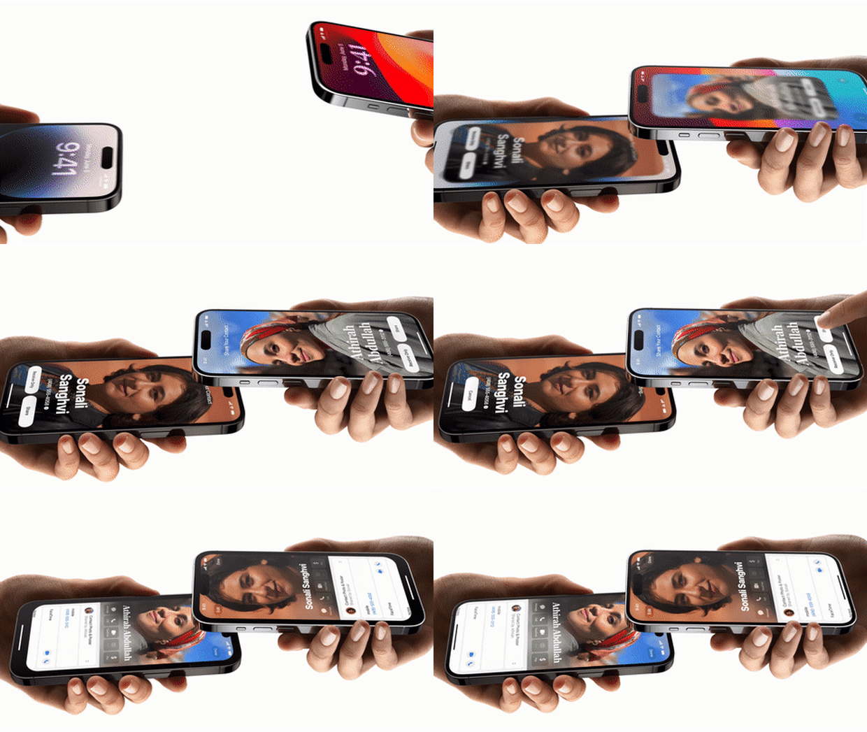
A new feature lets you customise what your contacts see when you call them; you can choose a photo, change the appearance of the text, add depth effects and more. I’m a little bit uncomfortable with it, though there is an option to just make you a big colourful monogram instead. I also haven’t received any calls from people using the feature yet, though I do anticipate this being another way to demoralise Android users by having them show up as a beige nothing instead of a curated image.
You can also use your custom image in a new feature called NameDrop, where you swap details by bumping phones.
My favourite new feature, which I’ve been using every day, is StandBy. You need a way to hold or prop your phone up while charging to use this new mode, but once activated it turns your phone into a full-on smart display to rival any small unit from Google or Amazon, and it’s great at the bedside. You can choose a full-screen clock, a rotating photo collection, or a widget view that could show anything from device charging statuses to your current podcast. It’s all easy to interact with using swipes, and activates automatically when you start charging in landscape orientation. If you like, you can have everything automatically turn red and dim, like an old-school LCD clock, when the phone senses the lights are off.
Elsewhere, widgets are more interactive now, so you can activate smart home devices or tick off items on a list from your home screen without opening any apps, and audio messages you receive are now automatically transcribed into text. Oh, and you can just say “Siri” now, instead of “Hey Siri”.
What about Watch?
All indications point to an Apple Watch Series 9 that’s practically identical to the Series 8, with most analysts believing a more powerful chip and some fresh colours will be the extent of the upgrades. Indeed, if Bloomberg’s Mark Gurman is to be believed you may need to wait until 2025 to see a significant change in the product.
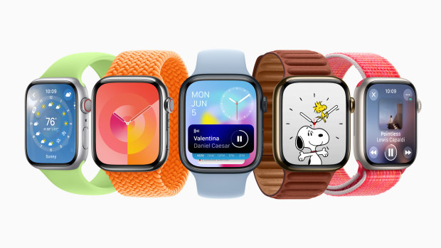
WatchOS 10 brings a new visual style and navigation system to Apple Watch.
The so-called Apple Watch X is apparently much thinner than the standard model, features a microLED screen and has magnetically attaching bands. The device will also likely have a blood pressure sensor and, if Apple waits until 2025 to launch, it will come at the 10th anniversary of the gadget, just like with the iPhone X. Then again, the original Watch was technically unveiled in 2014, so it’s possible we could see the Watch X next year.
Software-wise, Apple has changed the way navigation works on the Watch with WatchOS 10, and while I don’t personally think the result is any more intuitive it hasn’t been hard to get used to. From the home screen, swiping up from the bottom or twisting the digital crown now gets you a “smart stack” of widgets that supposedly change depending on your routine and apps. But for me, it’s almost always news and weather, which I never look at on the watch. Swipe up used to be the way you got to Control Centre, but now you press the side button to do that. To see your recent apps (which used to be the side button), you double-tap the crown.
Most Apple apps have also seen a major redesign in WatchOS 10, favouring big full-screen blocks of colour and lots of graphical information. I like the new 3D view in Compass even though I’d never actually use it for hiking, Fitness is a lot more useful and there’s now a Snoopy watch face. I also appreciate the new emotional awareness and mental health features of the Health app, which are also featured on iPhone as part of iOS 17.
Get news and reviews on technology, gadgets and gaming in our Technology newsletter every Friday. Sign up here.
Most Viewed in Technology
From our partners
Source: Read Full Article
